ABART!
Homework Projects.
Reflective Color Pencil Piece
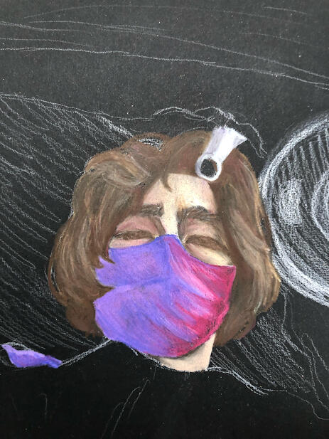
This was the first homework project that I worked on for Art Major I. The objective was to create a self portrait piece using a reflective surface, preferably something other than a mirror or flat surface. For this project I took a photo of water in the sink, with my reflection showing.
This project was rather challenging for me for multiple reasons. Firstly, I had never really drawn a reflective surface or a reflection before. Secondly, for the medium I choose I picked colored pencils, which i am not very skilled with. That on top of the new subject matter created a large challenged. I tried my best to overcome these challenges by redoing the piece multiple times and by studying the reference picture, but in the end, it could have been much better.
I am satisfied with the way I had created the face itself, especially with the colors of my mask. However, the sink itself and the reflective elements are severely lacking. This project humbled me in a way and allowed me to realize I really need to better my skills with different textures and surfaces. I enjoyed the challenge, as well. I had to really think about the colors and tones with not only the sink, but the reflection itself, since it was not just "my face" but a reflection of it.
I am content with this piece, but it is not my favorite. I hope to redraw it or do something similar in the future, since I think it could be something very cool as long as I better my skills and have a general vision for it in the future.
Artistically Unfinished
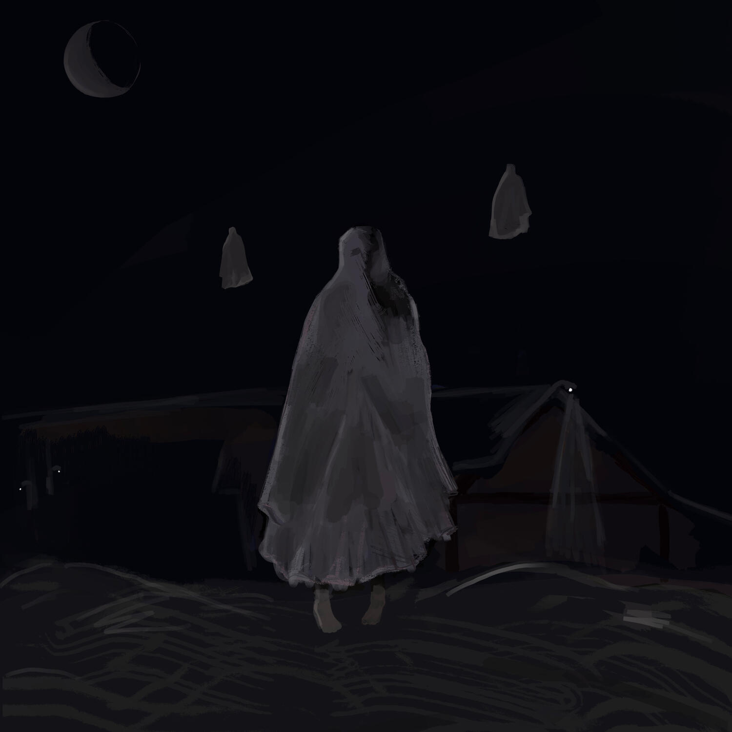
This project was meant to be "artistically unfinished", unfinished in a way that would add to the meaning of the piece, while not looking necessarily intentional.
This project was very fun, I enjoyed it a lot. I liked the openness of what could have been done with the rules given. I thought creating a ghost or horror type theme for this project would suit it well, since the unfinished element could go into some sort of feeling of the "unknown" or a similar idea. The image that I ultimately created was of a ghost in front of building on a dock with water surrounding it. The unfinished element was meant to be both the house in the background, and the small ghosts in the background, with only their outlines showing. Also, the darkness was meant to give a general feeling of "unknown" since it may be hard to see, and may appeared to be unfinished.
There were a few challenges that came along with this piece. None of the challenges came from the promp to make the piece appear to look unfinished, just from the elements I wanted to present. For example, darkness and lighting was a huge struggled. I had a hard time figuring what was too dark and what better suited the piece, I had to find a common ground with actually seeing what was happening and trying to keep that spooky element. I tried my best to overcome this, but I still could have improved it in some areas. At the end of the day, I really enjoy this piece. It is a little hard to see, but I had a lot of fun making it. I usually draw people or portraits, so this was fun and allowed me to go outside of my comfort zone. I drew a building, which I never do, and it turned out okay!
Extreme Foreshortening
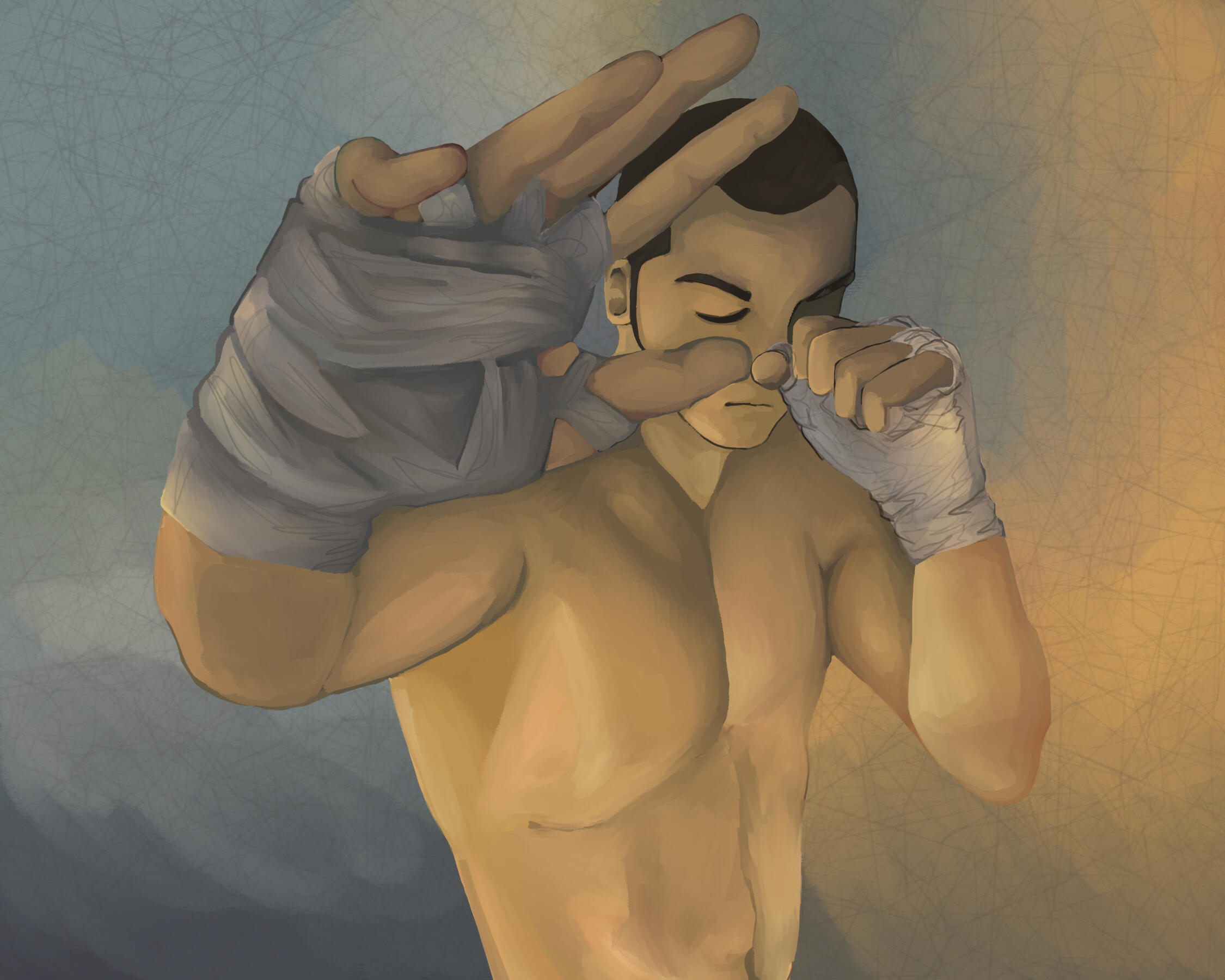
This project is most likely my most successful piece of the year. This was te first time I really tried to experiment with an extreme angle, so considering everything, I am pleased with how it came out. The anatomy of the figure was the biggest obsticle to overcome, I stuggled a lot trying to make it look like the reference image I was using. To properly get the form correct I traced over the reference image, making sure to get the overal flow ans shapes. Then, I looked at this sketch and efplicated it onto my digital painting. I redid the anatomy many times trying to get it just right, especially the difference in the hand and face. Overall, I think it turned out okay. I feel like the right hand looks a little strange, not eccearilly too big, bu a little strange. Nontheless, I am very pleased with now the torso came out.
Another struggle were the colors. I tried to make the colors as close to the reference image as possible, but I realized this was pointless in the end and was hurting the piece. Therefore, I more so just picked two colors I liked and focused on those. I really like how the background came out, especially in relation to the colors of the figure. The overll colors make the peiece seem calm.
I am very proud of this piece and how it came out. I hope to create similar pieces in the future, especially experiementing with more foreshortening and interesting angles in the future.
Final Project Piece
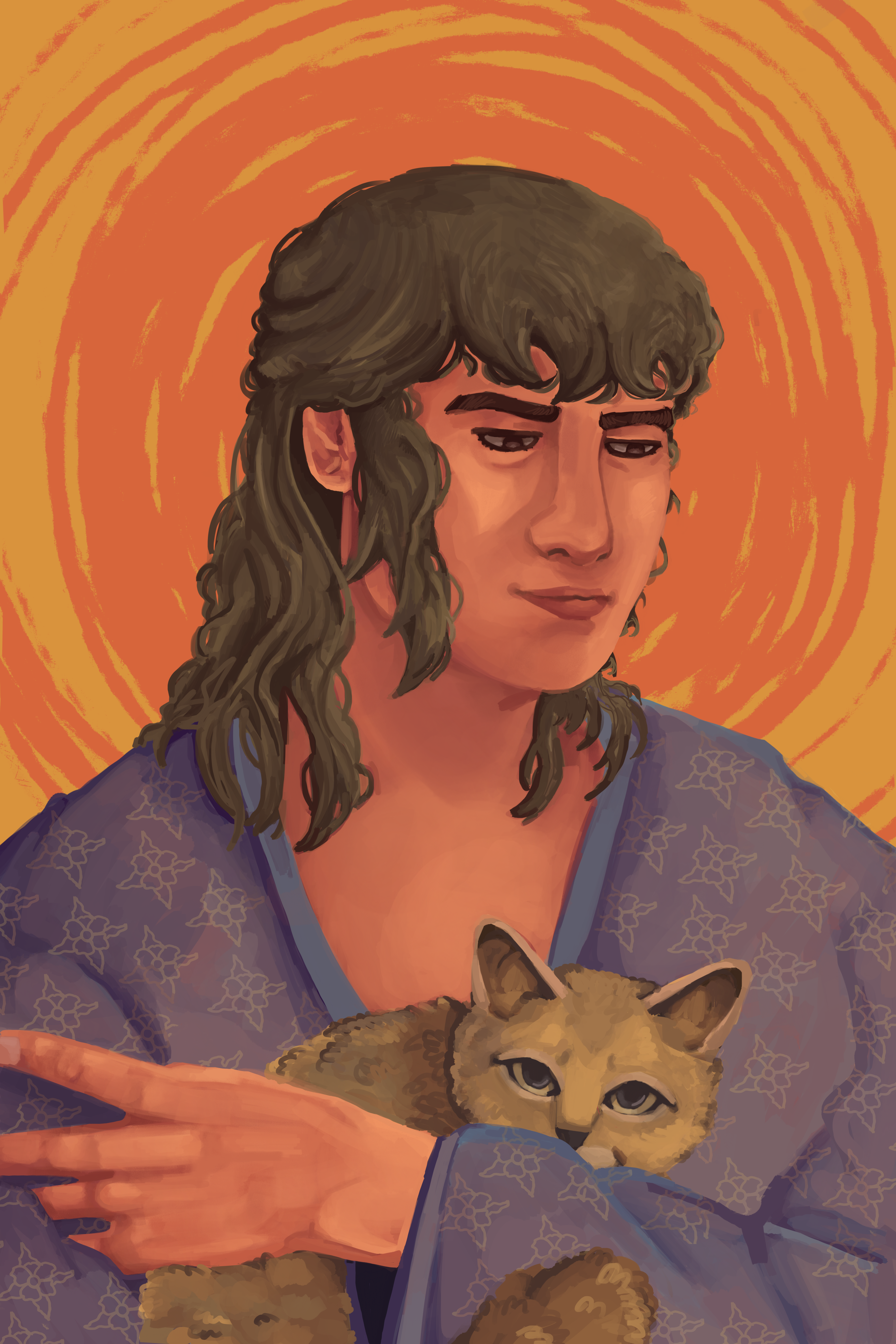
This piece was one of the hardest of the year. I had many different ideas going into it, some marking a piece about an overgrown warehouse, to an abstract portrait, to possible fusing the two ideas, and more. In the end, I choose to make a stylistic portrait. This piece was created being looking loosely at a reference. The most difficult part of actually creating the piece was with keeping a consistent style. I was unsure if I should make it more realistic or not. I wanted to show my skill and how I have improved in the year, but I also wanted to show more creativity than just pure anatomical skill. Therefore, I decided to go with a more stylized piece.
I struggled a lot with balance and the background with this one. I wanted to actually make a proper background, but I did not plan the piece out correctly, so any attempt I made for a background just seemed crowded and poorly done. I hope to fix this issue next year with AP Art.
Something that I believe I did well on was the cat that the person is holding, and the hair. I made sure to make sure the proportions and flow of them both were good, as well as the shading and colors. I am especially pleased with how the cat came out, since that was one of my biggest fears for the piece. I have never really drawn an animal before, especially in a fully-colored finished piece.
I tried hard to make this piece feel calm and peaceful, mostly through the colors and expression of the person. I think I succeeded in this goal, however, apparently this piece has a "Jesus vibe", which was not my intention. But, I guess it fits.
I'm a little torn on this piece. I do like how it came out, but I don't think it really shows my skills or improvement. I tried hard to try to convey this, but I do not know how much I did well in that front. If I planned it out better I most likely would have been more content with the end product, so that is something I will focus on more in the future.
Classwork Projects.
Still Life Color Pencil Piece
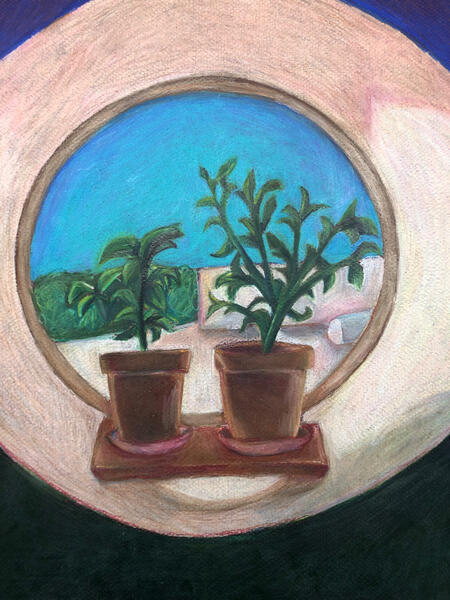
This was my first project of the year! This piece was actually one of the first done in the class, but since I joined late in the year, I began with this one. The objective was to find some type of window and draw whatever I saw. I picked a reference picture of two plants in front of a circular window that was facing the outside of the school. I picked this area, because I thought the dynamic of the two plants and the circular window were very interesting and appealing. The outside of the window was not too interesting, so I could have done more with that, but overall I really like the area I picked and how I presented it in my drawing.
I made this piece with colored pencil. I love the effects of color pencils, but I am not that experienced in using them. So, I thought using color pencils for this piece would challenge myself. I was originally going to try to make the features in the piece more realistic, but I realized I was not very good and achieving this, so I went with more vivid colors and just did whatever I thought looked nice.
Overall, I really like how this turned out. I really like how I made the background and the plants look. The leaves of the plant are a bit hard to see from the outside grass, however. If i ever do something similar with color pencil again, I will approach it differently.
Oil Painting Still Life
.jpg)
This was the second big project of the year that I did! Before this piece we did two practice assignments, color swatches, and a single still life object. For the preliminary still life object I choose a foot, which you can see below. This project is my first time using oil paints.
During the mini project I choose to paint a foot. During this project I was texting out the waters and was very unsure with how oil paints operate. that being said, I became more familiar with oil paint and how to use the medium as I progressed. When I finally finished the mini project and began on the bigger main project I had accumulated some knowledge and skill with oil paint.
The major take away that I got from this project is just how to use oil paints, as well as some color theory knowledge. Paint scares me, im scared that if I make one mistake then the piece is over and ruined. This project helped me to realize I can always fix and change my mistakes. I redid all aspects of this painting many times to get the cool I want, which in the end, made it look as good as it could have been. The longer this project went on the more I enjoyed it, since along the way I was getting more accustomed to oil painting and felt more comfortable with it. Oil paint itself was also my biggest obstacle. I had to learn how to use it and handle it properly since this project was really my first time using oil paint, and one of my first with any kind of paint in general. Overall, I did overcome this. I learned more and more as I went on, learning how to apply oil paint, how to fix my mistakes, how the color would interact with one another, and more. I feel that I did well on this piece.
Subtractive Charcoal Skeleton
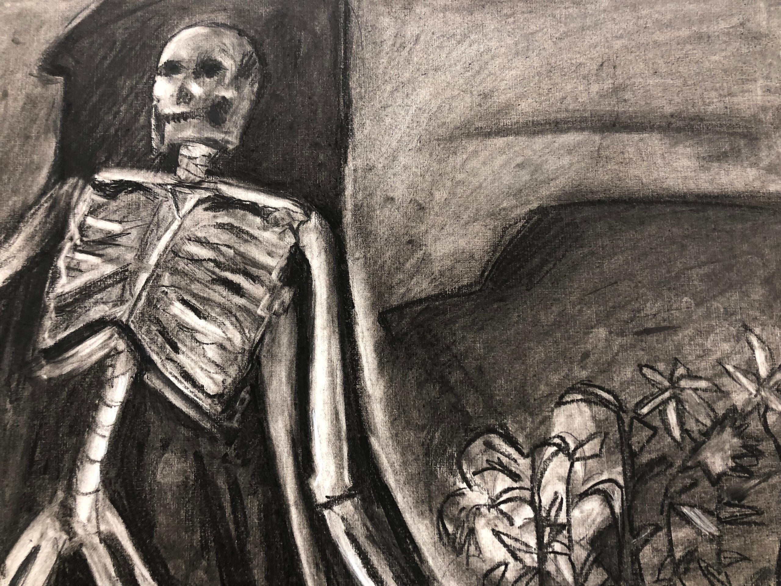
This was a very difficult project for many reasons. Firstly, the material itself was hard to use. Charcoal is very messy and gets everywhere, so using it was overwhelming. Furthermore, The project was based on erasing the charcoal, which just added to the difficulty. Nonetheless, it was very useful and interesting to try to erase and then reapply the charcoal to get the correct shades and shapes for the piece.
I think I did okay on this one. I tried and did the best that I could with what I was given. This was my first time doing a piece like this and one of my first with charcoal, so I was not entirely sure where to start. Also, the reference image I used was in portrait mode, but I did not account for this and drew horizontally, not vertically. So, this piece started out rough to say the least.